/* eslint-disable */
/* NISE — Sections A: Hero, About, Problem */

const { useState: useStateA, useEffect: useEffectA, useRef: useRefA } = React;

function Hero() {
  const { t } = useLang();
  const h = t.hero;
  const [h1Ref, h1Seen] = useReveal();
  return (
    <section id="top" className="hero">
      <div className="pattern-bg" />
      <div className="wrap hero-wrap">
        <div className="hero-text">
          <Reveal>
            <span className="chip"><span className="dot" /> {h.chip}</span>
          </Reveal>

          <h1 ref={h1Ref} className={`hero-h1 lines ${h1Seen ? 'in' : ''}`}>
            <span>{h.h1.line1}</span>
            <span>{h.h1.line2}<span className="serif" style={{ color: 'var(--accent)' }}>{h.h1.accent}</span></span>
            <span>{h.h1.line3}</span>
          </h1>

          <Reveal delay={300}>
            <p className="lead">{h.lead}</p>
          </Reveal>

          <Reveal delay={500}>
            <div className="hero-cta">
              <Btn href="#contact">{h.ctaPrimary}</Btn>
              <Btn kind="ghost" href="#portfolio" icon={false}>
                {h.ctaSecondary}
                <svg width="14" height="14" viewBox="0 0 24 24" fill="none" stroke="currentColor" strokeWidth="1.6" strokeLinecap="round" strokeLinejoin="round"><path d="M7 17 17 7M9 7h8v8"/></svg>
              </Btn>
            </div>
          </Reveal>

          <Reveal delay={700}>
            <div className="hero-meta">
              {h.meta.map((m, i) => (
                <React.Fragment key={i}>
                  {i > 0 && <div className="hero-meta-divider" />}
                  <div className="hero-meta-item">
                    <div className="hero-meta-num">{m.num}</div>
                    <div className="hero-meta-lbl">{m.lbl[0]}<br/>{m.lbl[1]}</div>
                  </div>
                </React.Fragment>
              ))}
            </div>
          </Reveal>
        </div>

        <div className="hero-graphic">
          <Reveal>
            <img
              className="hero-diagram"
              src="assets/brand/ecosystem-diagram.png"
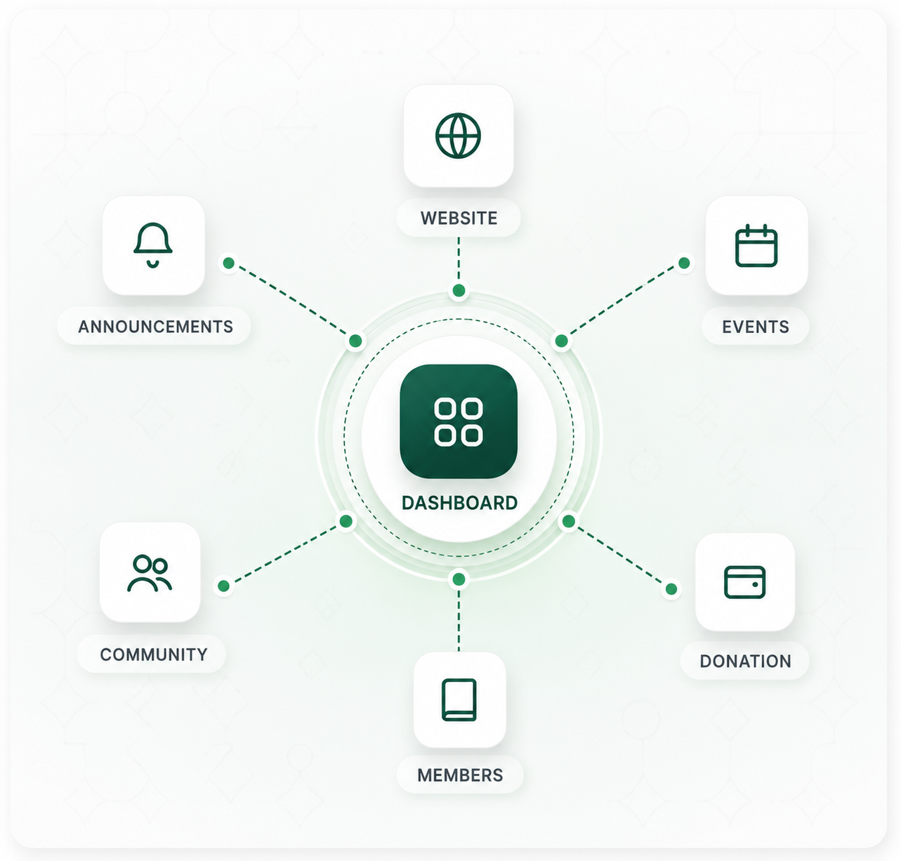
              alt="NISE ecosystem diagram — Website, Announcements, Events, Community, Donation and Members connected to a central Dashboard"
            />
          </Reveal>
        </div>
      </div>

      <style>{`
        .hero { padding-top: clamp(110px, 14vw, 160px); padding-bottom: clamp(60px, 8vw, 100px); overflow: hidden; }
        .hero-wrap { display: grid; gap: clamp(40px, 6vw, 80px); grid-template-columns: 1fr; align-items: center; }
        @media (min-width: 1000px) { .hero-wrap { grid-template-columns: 1.05fr 1fr; } }
        .hero-text { display: flex; flex-direction: column; gap: clamp(20px, 2.5vw, 28px); }
        .hero-h1 { max-width: 16ch; }
        .hero-cta { display: flex; flex-wrap: wrap; gap: 12px; }
        .hero-meta {
          display: flex; align-items: stretch; flex-wrap: wrap;
          gap: clamp(16px, 3vw, 32px);
          padding-top: clamp(20px, 3vw, 32px); margin-top: 4px;
          border-top: 1px solid var(--line);
        }
        .hero-meta-item { display: flex; flex-direction: column; gap: 4px; }
        .hero-meta-num { font-size: clamp(22px, 2vw, 26px); font-weight: 500; letter-spacing: -0.02em; color: var(--ink); }
        .hero-meta-lbl { font-size: 12px; color: var(--ink-3); line-height: 1.4; }
        .hero-meta-divider { width: 1px; background: var(--line); }
        @media (max-width: 599px) { .hero-meta-divider { display: none; } }
        .hero-diagram {
          display: block; width: 100%; max-width: 560px; margin: 0 auto;
          border-radius: var(--radius-xl);
          box-shadow: var(--shadow-2);
        }
        @media (min-width: 1000px) { .hero-diagram { max-width: 100%; } }
      `}</style>
    </section>
  );
}

/* ------------------------------------------------------------------ */
/* ABOUT                                                               */
/* ------------------------------------------------------------------ */
function About() {
  const { t } = useLang();
  const a = t.about;
  const [h2Ref, h2Seen] = useReveal();
  return (
    <section id="about" className="about">
      <div className="wrap">
        <div className="about-grid">
          <Reveal>
            <span className="eyebrow">{a.eyebrow}</span>
          </Reveal>

          <div className="about-main">
            <h2 ref={h2Ref} className={`lines ${h2Seen ? 'in' : ''}`}>
              <span>{a.h2.lines[0]}</span>
              <span>{a.h2.lines[1]}</span>
              <span>{a.h2.lines[2]}</span>
              <span><span className="serif" style={{ color: 'var(--accent)' }}>{a.h2.accent}</span>{a.h2.tail}</span>
            </h2>

            <Reveal delay={300}>
              <p className="lead" style={{ marginTop: 28 }}>{a.lead}</p>
            </Reveal>

            <Reveal delay={500}>
              <p className="body" style={{ marginTop: 18, maxWidth: '56ch' }}>{a.body}</p>
            </Reveal>
          </div>

          <Stagger className="about-list">
            <div className="about-item"><Icon.globe /><span>{a.list[0]}</span></div>
            <div className="about-item"><Icon.grid /><span>{a.list[1]}</span></div>
            <div className="about-item"><Icon.users /><span>{a.list[2]}</span></div>
            <div className="about-item"><Icon.layers /><span>{a.list[3]}</span></div>
            <div className="about-item"><Icon.cloud /><span>{a.list[4]}</span></div>
          </Stagger>
        </div>
      </div>

      <style>{`
        .about-grid {
          display: grid; gap: clamp(40px, 5vw, 64px);
          grid-template-columns: 1fr;
        }
        @media (min-width: 1000px) {
          .about-grid {
            grid-template-columns: 200px 1fr 1fr;
            align-items: start;
          }
        }
        .about-main h2 { max-width: 18ch; }
        .about-list { display: flex; flex-direction: column; gap: 2px; }
        .about-item {
          display: flex; align-items: center; gap: 16px;
          padding: 18px 0;
          border-top: 1px solid var(--line);
          color: var(--ink); font-weight: 500;
        }
        .about-item:last-child { border-bottom: 1px solid var(--line); }
        .about-item svg { color: var(--accent); flex-shrink: 0; }
      `}</style>
    </section>
  );
}

/* ------------------------------------------------------------------ */
/* PROBLEM                                                             */
/* ------------------------------------------------------------------ */
function Problem() {
  const { t } = useLang();
  const p = t.problem;
  return (
    <section id="problem" className="problem">
      <div className="wrap">
        <div className="sec-head">
          <Reveal><span className="eyebrow">{p.eyebrow}</span></Reveal>
          <Reveal delay={100}><h2>{p.h2}</h2></Reveal>
          <Reveal delay={200}>
            <p className="lead">{p.lead}</p>
          </Reveal>
        </div>

        <Stagger className="grid-3 problem-cards">
          {p.items.map((it, i) => {
            const I = Icon[it.icon];
            return (
              <article key={i} className="card problem-card">
                <div className="icon-tile"><I /></div>
                <h3 style={{ marginTop: 24 }}>{it.title}</h3>
                <p className="body" style={{ marginTop: 12 }}>{it.desc}</p>
              </article>
            );
          })}
        </Stagger>

        <Reveal>
          <blockquote className="pull problem-quote">"{p.quote}"</blockquote>
        </Reveal>
      </div>

      <style>{`
        .problem-cards { margin-top: 8px; }
        .problem-card h3 { font-size: 22px; letter-spacing: -.02em; }
        .problem-quote { margin-top: clamp(48px, 6vw, 72px); }
      `}</style>
    </section>
  );
}

Object.assign(window, { Hero, About, Problem });